Visual identity refers to the visual elements used to represent your brand. This could be your logo, colour palette, illustration style, typography, icons, photography, and the overall aesthetic style of the brand.
As your visual identity designer, I can cater from as little as a single logo design to a complete visual identity package.
Want to know what is included in a single logo package? Scroll down below to find out.
BRANDMARK
—————–
This is the visual, iconic representation of your brand. It could be made using a typeface consisting of your brand’s initials (e.g. “VA”) paired with a visual that speaks of your brand’s value (e.g. two hands, representing helping hands). Think of Chanel (“CC” logo), McDonald’s (arched “M”), and Pinterest (“P” logo).
WORDMARK
—————–
This is the wording element of your logo consisting of your brand’s name in full. Using a single or combination of typefaces, your brand name is typed out in full and arranged in an interesting and balanced manner. The wordmark links the brandmark to your brand’s full name, allowing people to recognize your brand in full.
LOGO LOCKUP
—————–
This is where the brandmark and wordmark are combined into a single, complete form of your logo. Depending on the brand and visuals, some logo lockups can be further expanded into several arrangements to improve flexibility while still providing a cohesive visual identity to your brand.
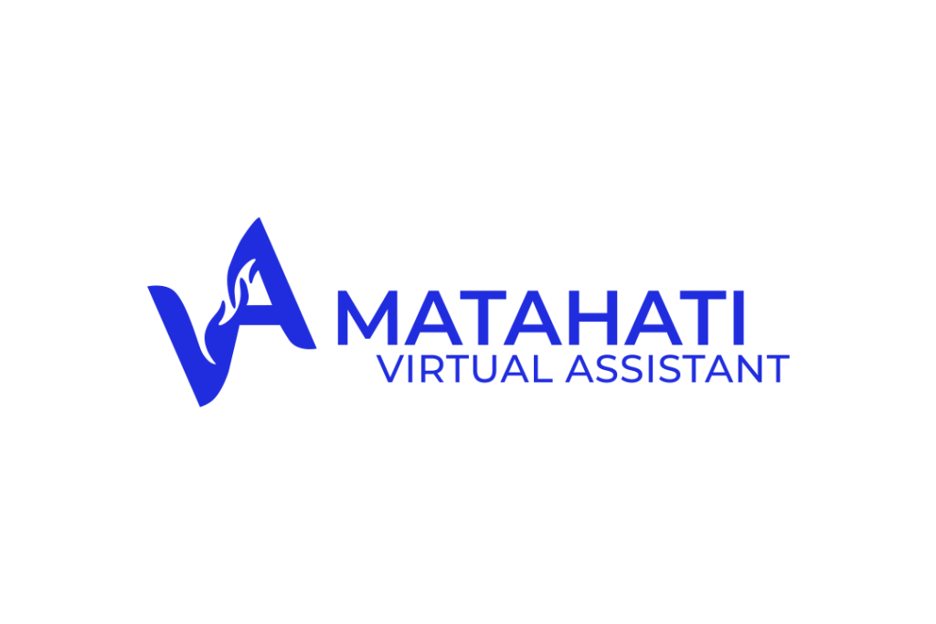
HORIZONTAL
—————–
Horizontal arrangement is when the brandmark is placed next to the wordmark. It can be found in many types of applications, such as signboards, website menu or footer, and letterhead. It is most suitable for use when the vertical space is limited, thus a horizontal arrangement of the logo is most suitable.
VERTICAL
—————–
Vertical logo arrangement is when the brandmark is placed above the wordmark, creating a vertical movement for the eyes as it moves from the top (brandmark) to the bottom (wordmark). It is most suitable for use when the horizontal space is limited, such as business cards, mobile-first designs, and phone cases.
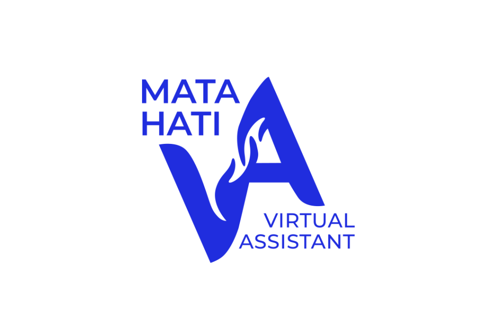
VERTICAL STYLIZED (OPTIONAL)
—————–
Some logos might require a stylized form to improve visual balance, such as the Matahati VA logo. In the version above, the first part of the wordmark (Matahati) is placed on the top left side of the brandmark, filling the white space there. The next part (Virtual Assistant) is placed on the bottom right side, balancing the overall look of the final logo lockup.
A good logo package would include a variety of colour options. This further enhances your logo’s flexibility while ensuring a cohesive visual identity for your brand.
A typical logo package would include the following versions, which are: full colour, white, greyscale, and black.
Ready to invest in your brand new logo? Check out my packages below:
© 2024 MATAHATI VIRTUAL ASSISTANT ENTERPRISE | CA0379236-D
ALL RIGHTS RESERVED